Case study
SQ1 Clinic
A concept full-stack mobile patient portal for a family medicine clinic. Appointment booking, lab results, secure messaging, billing, and pharmacy, designed and built end to end with AI-assisted development. Not a real clinic, not published.
- Role
- Product Design & Development · Ragheeb Designs Inc.
- Timeline
- Freelance
- Tools
- React Native · Expo · Supabase · Zustand · TypeScript · Claude Code
- Outcome
- Concept patient portal and admin panel, built as a working demo
- HealthTech
- Mobile
- Full-Stack
- AI-Native
Overview
This is a concept. SQ1 Clinic is not a real clinic and this has not been published or deployed for any patients. It's a family medicine patient portal exploring what it would take to get a clinic off phone calls and paper. The patient app runs on Android, covers the full care cycle, and connects to a web-based admin panel a clinic's staff would use on their end.
The scope is bigger than most single-developer projects. Appointment booking with a multi-step flow, lab results with clinical detail breakdowns, secure messaging between patients and the care team, billing with insurance tracking, a pharmacy section, and push notifications throughout. Two surfaces, one backend, one deadline.
The full experience
The demo runs against a fully seeded Supabase database with a fictional patient profile, Sarah Johnson, who has an appointment history, lab results with clinical detail, active conversations, billing records, and pharmacy orders. Walking through her account shows exactly what a real patient would see, if this were ever put in front of one.
- Multi-step booking with service, doctor, date, time, and reason selection.
- Lab results with per-marker reference ranges and flag indicators.
- Real-time secure messaging between patient and care team.
- Billing with category labels for OHIP, uninsured, and lab services.
- Pharmacy section for prescription tracking.
- Push notifications for appointment reminders, result availability, and new messages.
- Web admin panel on the clinic side sharing the same backend.
Live app — tap and scroll to explore
Live app — best viewed on iPad or desktop
The problem
Most family medicine clinics in Canada are still running on phone calls. You call to book, call to reschedule, call to ask about your results. The clinic staff field those calls all day. The patients wait on hold. Neither side has a better option available to them.
A clinic in that position would want to change that before patient volume grows further. Patients need to be able to self-serve the common stuff, booking, checking results, reviewing bills, refilling prescriptions, without the call. And the admin team needs a real dashboard instead of spreadsheets.
- Patients had no way to book, cancel, or reschedule without calling during clinic hours.
- Lab results were communicated by phone or mailed out. No digital access, no context for what the numbers meant.
- Billing questions required back-and-forth calls. Patients had no record of what was covered and what wasn't.
- The messaging between patients and the care team was done through personal email, no thread history, no structure.
Why build both ends
The first decision was to build the patient app and the clinic admin panel at the same time rather than starting with one and adding the other later. A patient booking an appointment is useless if no one on the clinic side can see it. The two surfaces had to go up together or neither one was useful.
The tech stack was Supabase for the backend, React Native with Expo for the patient app, and Next.js for the admin panel. Supabase handled auth, the database, real-time subscriptions, and row-level security without needing a custom server. Claude Code was the development tool throughout, from generating the initial scaffolding to debugging edge cases in the booking flow.
The patient app was the priority surface for the demo. The idea was to walk through the experience as a new patient booking their first appointment, then as an existing patient checking results and messaging the doctor. Those two flows drove almost every design decision.
Building it
Home screen
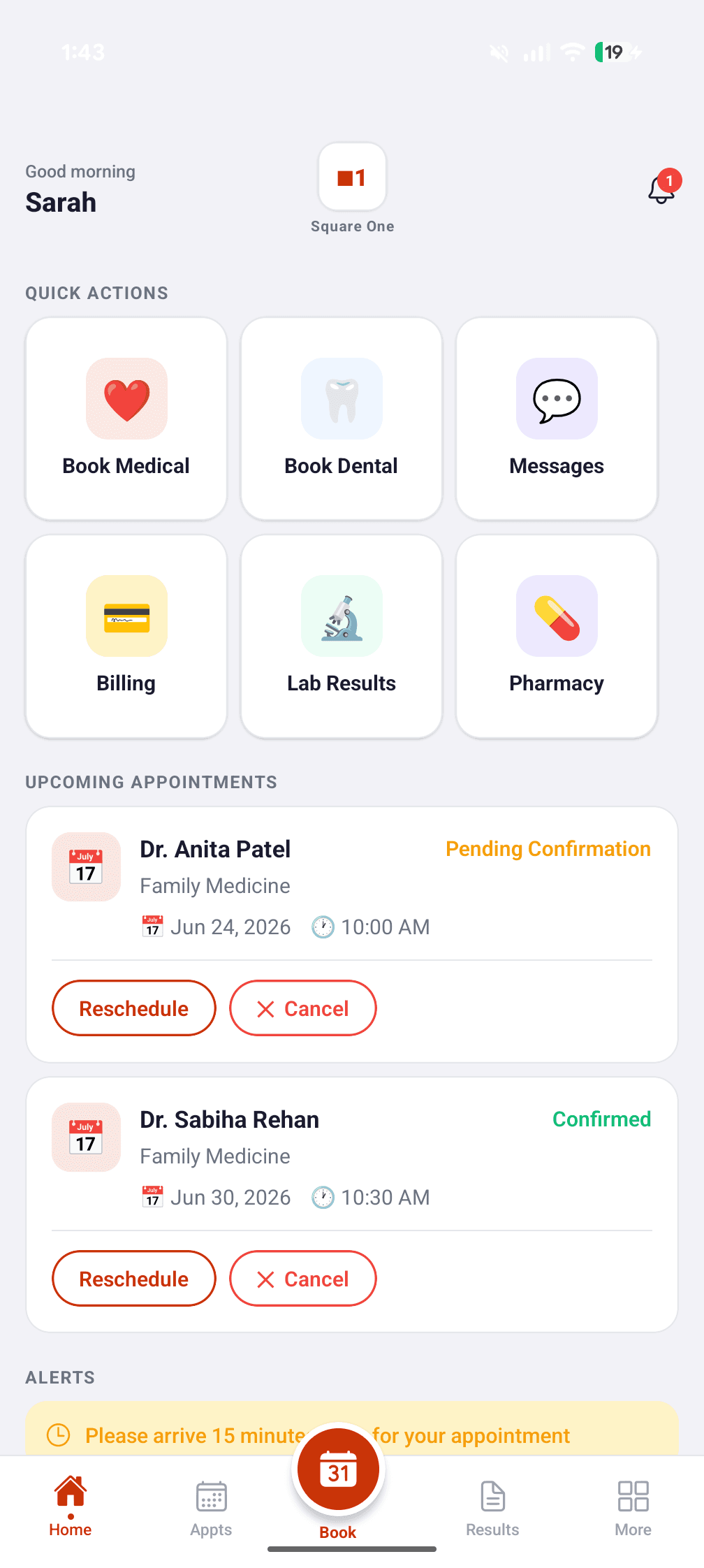
The home screen opens to six quick actions in a 3x2 grid: Book Medical, Book Dental, Messages, Billing, Lab Results, and Pharmacy. An upcoming appointment card sits above them when you have one. The bottom nav keeps the five main tabs accessible at all times, with a floating Book button in the center as the primary CTA. Everything the patient needs on a typical visit is one tap away.
Booking flow
Booking runs across five steps: choose a service, pick a doctor, select a date and time, add a reason for the visit, and confirm. Each step is one screen. The progress indicator at the top keeps the patient oriented without cluttering the layout. The whole thing takes under two minutes.
Lab results
The records tab shows all lab results from Supabase. Tapping into a result gives the full clinical breakdown: individual markers, reference ranges, whether each value is normal or flagged, and an ordering doctor note. A patient looking at a CBC result can see that their hemoglobin is low and what the normal range is, without calling to ask.
Messaging
The messages section shows active conversations with care team members. Each thread is a real-time chat with message bubbles, timestamps, and read receipts. The input bar stays pinned to the bottom of the screen when the keyboard comes up. The admin side sees the same threads in the web panel and can respond directly.
Billing
The billing tab lists all invoices with category labels showing whether a visit was OHIP-covered, uninsured, or a lab service. The status, paid or unpaid, is visible at a glance. Tapping an invoice shows the line items. No more calling to ask what a charge was for.
Admin panel
The clinic admin panel runs on the web and is designed for larger screens: iPads and desktop computers. Staff can see all incoming messages, respond to patients, review appointment requests, and access patient records. It shares the same Supabase backend as the mobile app, so what a patient books on their phone appears immediately in the admin view.
Results
This is a concept. It has not been published or deployed for any real clinic. The app is demo-ready with all flows functional against a seeded database, and a walkthrough covers both the patient journey and the admin panel in the same session.
- 2 surfaces
- Patient mobile app and clinic admin panel, one Supabase backend
- 5-step
- Booking flow from service selection to confirmed appointment
- Concept
- Full demo patient account with appointments, results, messages, billing, and pharmacy
Learnings
Building and designing at the same time is different from handing off specs and waiting. When something that looks good in theory turns out to be awkward to actually tap, you find out immediately and fix it instead of filing a ticket. The gap between design intent and implementation shrinks to almost nothing.
Building both the patient app and the admin panel in parallel was the right call, but it also forced a clarity that single-surface projects don't require. Every feature had to be thought through from both sides at once. A notification the patient receives means something triggered it on the admin side. A booking the patient makes has to surface correctly in the clinic view. You can't design one without the other.
Claude Code changed the scope of what's possible in a freelance timeline. Generating the booking flow scaffolding, debugging the Supabase row-level security rules, fixing the keyboard behavior on Android, all of that happened in hours instead of days. The work that remained was judgment calls: what order should the booking steps be in, how much clinical detail belongs in a result view, what should the empty state say when a patient has no messages yet.
Conclusion
This is a concept, built as a demo rather than for any real clinic, and it has not been published. The code is the same as what a production deployment would need and the database is structured correctly, but turning it into a live patient portal for an actual clinic would still be its own project.
It's also the clearest example I have of what AI-native development actually changes. Not the quality of the decisions, those are still human, but the distance between having an idea and having a working version of it to evaluate. That compression changes what you can build alone and on what timeline.
Continue exploring
More work that pairs rigor with craft
Open another case study or return to selected work on the homepage.