Case study
Project NAFAS
Designing a voice-first psychological safety companion for time-constrained triathletes, reducing cognitive load, respecting athlete autonomy, and delivering non-judgmental support through Kona, an AI-powered companion.
- Role
- Lead UX/UI Designer · UX Research · Design Strategy · Prototyping
- Timeline
- Ongoing
- Tools
- Figma · Lovable · Supabase · AI-assisted exploration
- Outcome
- Voice-first psychological safety companion
- HealthTech
- AI-Native
- Mobile
- Voice-First
Overview
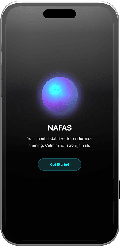
NAFAS is a voice-first psychological safety companion for time-constrained triathletes and endurance athletes. The app pairs a non-judgmental AI companion, Kona, with daily check-ins, post-workout reflection, and lightweight insights to help athletes manage stress, build confidence, and maintain mental clarity alongside their existing training platforms.
The design challenge wasn't to replace coaching. Garmin and TrainingPeaks already handle the performance data. NAFAS sits in the gap those tools don't touch: the mental side of the training cycle. Every decision came back to three questions: does this reduce cognitive load, does this respect athlete autonomy, and does it maintain psychological safety?
Problem & UX Research
Endurance athletes, especially triathletes balancing training with work and life, have no dedicated digital space for the psychological side of their sport. The tools that exist are built for performance data, not mental state.
What Athletes Were Experiencing
- Anxiety, stress, and confidence loss mid-cycle with nowhere to process it.
- Existing platforms (Garmin, TrainingPeaks) surface performance metrics but provide nothing for psychological support.
- No digital tools existed specifically for psychological safety in endurance training, athletes were managing this gap informally or not at all.
Strategy & Discovery
Research drew from three sources: a competitive audit of endurance platforms, sports psychology literature on stress and burnout, and HCI research on voice-first interfaces. Everything pointed to the same thing: the mental side of training is a relational problem, not a content problem.
Key Research Insights
- Athletes respond best to concise, empathic prompts. Verbose or metrics-heavy responses increase anxiety rather than reduce it.
- Visual overload and excessive data are counterproductive here. The experience needs to feel calm, not informative.
- Control over notifications, tone, and interaction frequency is a prerequisite for trust. Athletes disengage the moment the app feels prescriptive.
Design Process
AI-Assisted Design Approach
I used Lovable to prototype the onboarding flows and check-in screens quickly, and AI to generate layout alternatives and pressure-test copy at speed. Every UX decision was mine.
Low-Fidelity Wireframes
Four wireframe screens were developed to validate the core interaction model before moving to high-fidelity design. Each screen addressed a distinct part of the experience: the home layout, the daily check-in flow, the Kona chat interface, and the insights screen.
Home Screen Architecture
The home screen has two zones. The top half is Kona: her presence and the 'Talk to Kona' CTA. The bottom half shows weekly workouts and life reminders. Athletes know exactly where to look the moment they open the app without having to hunt for anything.
Onboarding Design
Onboarding asks for the minimum Kona needs to feel relevant: experience level, stress response style, primary worries, and tone preference. Kona introduces herself through a brief check-in before asking for any personal information. The optional Garmin and TrainingPeaks integrations come after the core flow, not during it. You earn the right to ask for something personal before you ask for it.
Kona Chat & Voice-First Interaction
Kona is voice-first: tap to start, tap to stop. Text is always available as an alternative. Responses are concise, reflective, and non-judgmental. One rule we never bent: Kona never gives coaching or medical advice. When it wasn't sure, it said so rather than generating something plausible. Athletes in early testing responded better to honesty than to a confident-sounding wrong answer.
Post-Workout Check-In
The check-in separates emotional and physical scales to prevent conflation, athletes often rate physical performance well while emotional state is poor, and the design needed to honour that distinction. A voice note option adds depth without requiring it. Kona responds with validation and reassurance only: no performance analysis, no recommendations, no unsolicited comparisons.
Solution & Key Improvements
Results
User testing is scheduled following the design review. Sessions will run with 6–10 endurance athletes unfamiliar with NAFAS, using remote moderated think-aloud protocols to validate onboarding clarity, chat usability, and perceived psychological safety.
- 6–10
- Athletes recruited for upcoming moderated usability sessions
- 1 tap
- Access to Kona from any screen, the primary friction reduction target
- 0
- Coaching or medical advice from Kona, a hard, non-negotiable design constraint
Learnings
- AI honesty about its limits builds more trust than confident-sounding responses. Athletes in testing responded better to 'I'm not certain' than to plausible-but-wrong reassurance.
- Cognitive load hits differently in a psychological safety context. Every extra decision point is a potential exit for someone who's already stressed. Standard usability metrics don't capture that.
Conclusion
Designing for psychological safety demands the same rigour as any complex UX challenge, but the constraints are different. Clarity, honesty, and respect for autonomy aren't things to aim for here. They are the product. NAFAS works when Kona feels less like an app and more like a consistent, trustworthy presence that helps athletes hear themselves think.
Continue exploring
More work that pairs rigor with craft
Open another case study or return to selected work on the homepage.